This wasn’t the first time I used Codex to modify code. For tasks like backend pipelines, API integration, test fixes, and report generation, I usually just throw the objective in, let it read files, modify code, run validation, and commit. The problem arose with this frontend refactor: I hadn’t done a UI draft first, and the business structure had already been laid out. Once the old interface exists, what the model sees is not just the requirements, but also ready-made components, ready-made routes, ready-made styles, and a bunch of historical inertia.
My initial reaction was also a typical one: just keep adding prompts. Allow destructive refactoring, redesign the UI and interaction logic, don’t make the elements too dense, adapt it for 24-inch and 32-inch monitors, focus on core features, and don’t be conservative. Every sentence looked correct on its own, but taken together they still lacked one thing: what it should ultimately look like.
What’s Stuck Isn’t the Button Color
strategy_studio is not a small tool with only two or three buttons. The README already positions it as a Chinese-first strategy research platform: a Next.js frontend, FastAPI API, PostgreSQL, Worker, Scheduler, and the Yahoo synchronization pipeline all running together. The frontend README further converges the pages into a single research workbench: sample preparation, experiment configuration, task tracking, result review, template maintenance, as well as report details and operations/maintenance entry points.
The front-end issues of this kind of project, on the surface, are “not good-looking enough,” but in reality, the information hierarchy hasn’t been established. Should users look at market data first, or look at backtesting tasks first? Among the curve, indicators, input parameters, and re-run button in the report details, which is more important? Is the homepage a navigation page or a workbench? Should the large screen be filled up, or should it leave some breathing room?
These instructions are described only in words, and Codex easily interprets them as “make some tweaks to the existing page.” It will modify components, adjust spacing, change colors, but still follow the old structure. Allowing destructive refactoring isn’t enough either, because destructive refactoring addresses whether the code can be heavily modified, not whether there is an acceptable visual goal.
I went out during the day, and suddenly thought of something in the evening: don’t let Codex keep guessing the UI. First, draw the UI design mockup on the ChatGPT web client, then hand the image over to Codex to recreate it.
The prompt used at the time was very straightforward:
https://github.com/ttf248/strategy_studio Analyze the front-end code of the current project, understand the business logic, and as a professional UI designer and interaction designer, help me redesign a set of front-end pages. Produce a separate design for each page, and make sure they are adapted for 24-inch and 32-inch monitors. The elements should not be too dense, so that users can easily focus on the core functions.
The result produced by this step is much more stable than continuing to pile up adjectives in Codex. It first provides a visible target: how the page is laid out, how the module proportions are divided, where the visual center is, and roughly how much whitespace is used. When Codex takes over afterward, the task shifts from “redesigning based on aesthetics” to “understanding the business from the diagram and recreating the code.”
The color scheme should also be turned into material first
The first round of diagrams solved the layout issue, but the default color scheme is still the standard blue-and-white of a regular admin system, which doesn’t quite match my aesthetic. If at this point I just throw “I don’t like blue-and-white, switch to a more sophisticated color scheme” to Codex, it’s essentially still letting it guess.
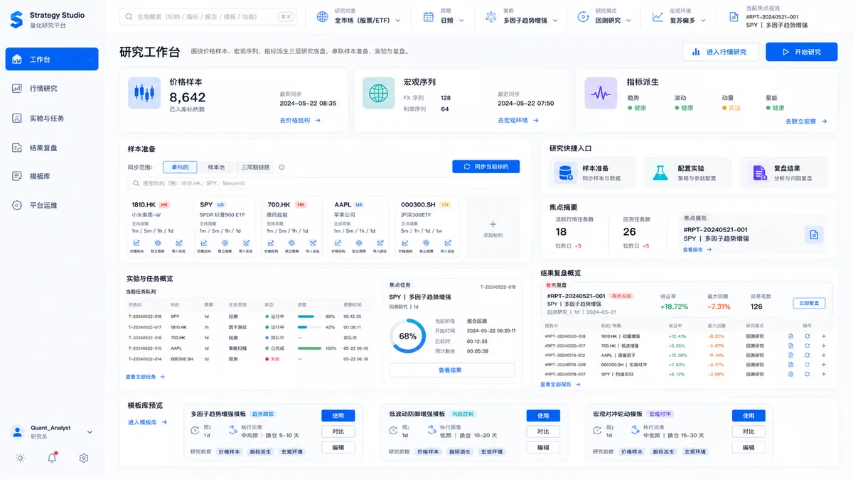
This is the initial blue-and-white color scheme. It already illustrates the page structure, but the overall feel is still rather generic and resembles an ordinary admin dashboard.
I changed my approach afterward: first, I discussed the color scheme direction on the ChatGPT web client, making the base color, accent color, card hierarchy, and the feel of a research tool clear, then asked the image model to show its intent based on this direction. It is not an official Figma design, nor is it a complete design system, but it is already sufficient to lock down the things most likely to drift during the front-end refactor.
What we ultimately got was not a single “big-and-comprehensive homepage” design, but design drafts broken down by page: Homepage, Market Research, Backtest Experiment, Report Center, Report Details, Strategy Templates, Operations & Maintenance. This breakdown is critical. The frontend of strategy_studio is not a marketing page but a research tool; the Homepage, Market page, and Report Details page each serve different reading tasks and cannot all be crammed into the same set of card grids.
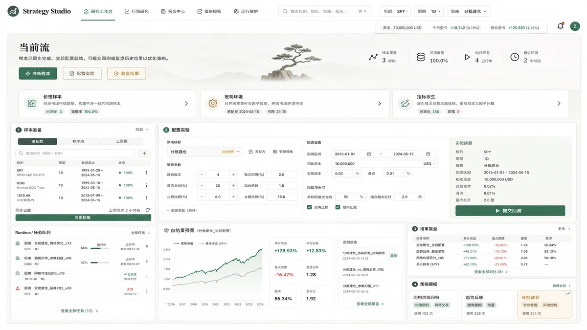
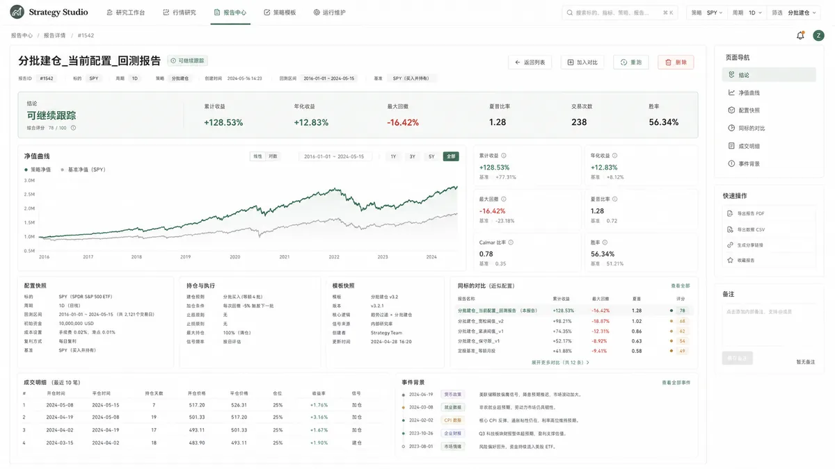
Once the design comes in, Codex’s role becomes clear. It doesn’t act as a UI designer from scratch; instead, it reads the existing business logic, breaks down components, adjusts layouts, aligns interaction states, runs lint/build, and then refactors the legacy frontend to a target state that closely matches the design mockups.
Not just a “smarter web version”
Later, I checked the official materials again, trying to confirm whether this issue could be explained as “ChatGPT has different intelligence capabilities across different channels,” or as “Codex has its features gutted when used directly.” That explanation is too crude.
OpenAI’s description of Codex CLI is a coding agent in the local terminal: it can read code, modify code, and run commands in the current directory. Codex web, on the other hand, handles code tasks in a cloud environment. When OpenAI discusses the Codex agent loop, the focus is not on “the model coming up with everything out of thin air,” but rather on how model reasoning, context management, tool invocation, file read/write, and command execution together constitute a software task.
ChatGPT Images is another entry point. According to OpenAI Help’s description of Images in ChatGPT, users can create and edit images in conversations, and also create mockups or creative visuals. This product form is naturally more suitable for exploring visual goals first, because its deliverable is the image itself, rather than immediately diving into code.
So the difference this time isn’t “who is smarter,” but rather that the task forms are different. Hand “redesigning the UI” directly to Codex, and it will think from within the code repository: which files need to be changed, which components cannot be broken, and how to make the build pass. Hand the same business context first to ChatGPT Images, and it will first compress the abstract aesthetics and information hierarchy into a visible target image.
This also explains why Codex later became easier to use. It’s not that the design mockups bypassed Codex, but rather that the design mockups supplemented Codex with context and acceptance criteria. The official Codex prompting documentation also emphasizes that you need to provide Codex with relevant files, images, and clear completion standards. Without images, “the elements shouldn’t be too dense” is just an adjective; with images, it becomes a reproducible layout constraint.
Smoother Chain
After this, I’ll break down this kind of frontend refactoring into three parts.
In the first stage, start with visual exploration. Have the ChatGPT web client read the repository, understand the business, and generate diagrams per page, then iterate on color schemes, density, large-screen adaptation, and visual hierarchy. The output of this stage is not code, but target diagrams.
In the second step, hand over the target screenshots and engineering constraints to Codex. The prompt should not stop at “redesign the UI”; it needs to clearly specify which images are the targets, which business logic must not be broken, which pages are allowed to undergo breaking refactors, and which tests and builds must pass.
The third phase enters engineering restoration. This is where it becomes appropriate to have Codex run in goal or continuous task mode: first read the frontend structure, then split the implementation by page, run verification after each page is completed, and finally perform a unified check of interactions and responsiveness.
I used to treat “writing harsher prompts” as the solution. Looking back now, what’s more useful in frontend refactoring isn’t harshness, but filling in the missing intermediate artifacts. Without UI mockups, disruptive refactoring just breaks things apart further; with UI mockups, disruptive refactoring finally has direction.
This workflow is not only suitable for strategy_studio. Any personal project that already has business logic but whose frontend has long been patched together as it goes along can be handled the same way: first let the image model draw out the interface targets, then let Codex turn those targets into code. The models are not replacing one another; each one takes on the segment that better matches its own kind of work.
References
- ttf248/strategy_studio GitHub Repository
- Strategy Studio README
- Strategy Studio Frontend README
- Strategy Studio UI Design Drafts Directory
- OpenAI Help: Images in ChatGPT
- OpenAI Help: ChatGPT Capabilities Overview
- OpenAI Developers: Codex CLI
- OpenAI Developers: Codex web
- OpenAI Developers: Codex prompting
- OpenAI: Unrolling the Codex agent loop
写作附记
Original Prompt
In daily use of codex for calling the ChatGPT model to write code during the development of the open-source project https://github.com/ttf248/strategy_studio, I started off without creating UI mockups and went straight into business logic development, which resulted in an unplanned front-end interface. I tried writing prompts directly in codex — allowing destructive refactoring, redesigning the UI and interaction logic — but no matter how I adjusted them, the results were never quite right. At that point, I still hadn’t suspected anything wrong with codex itself. During the day, I went out, and at night, inspiration struck: what if I used the web version to call image2 to generate a set of UI design mockups, then handed them off to codex running the goal model to faithfully reproduce them in code? I gave it a quick try and it worked without any issues. Here is the prompt I used:
https://github.com/ttf248/strategy_studio Analyze the current project’s front-end code, understand the business logic, and act as a professional UI designer and interaction designer to help me redesign a complete set of front-end pages. Generate a separate image for each page, making sure they adapt to 24-inch and 32-inch monitors. Keep elements from being too densely packed so users can focus on the core functionality.
At this point the results were already pretty good, but the default color scheme — the conventional blue-and-white — didn’t match my aesthetic taste. So I continued refining the approach: first, we discussed and agreed on a suitable color palette through web chat; then, image generated a demo based on that palette; finally, combining the color scheme with the previous prompt, we got this:
https://github.com/ttf248/strategy_studio/tree/main/ui
I’ve written a lot of content — please organize it and wrap it up into a single blog post. For any questions you’re unsure about, search the web on your own for reference. The repository at https://github.com/ttf248/strategy_studio/tree/main/ui contains a lot of images; feel free to pick a couple and embed them in the blog post.
Writing Approach Summary
This rewrite preserves the original’s judgment and materials, but changes the opening from “here is the complete answer first” to “let’s first step into the scene where the frontend refactor stalled.” The article trims away generalized model reviews and focuses only on the shift that actually worked in this workflow: turning the visual goal into a diagram first, then letting Codex handle the engineering restoration.
Comments will load when you scroll here.